How to Read a Stock Chart
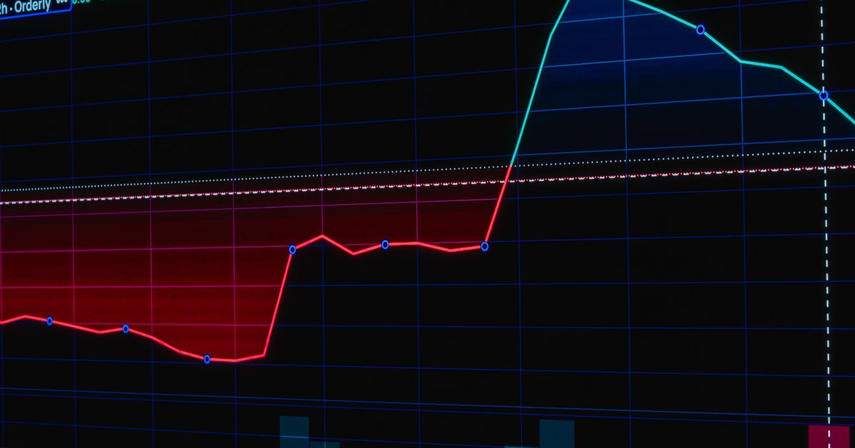
A stock chart is a picture of one thing: what the price did over a stretch of time. Learning to read it is useful, as long as you keep in mind what it can and cannot tell you. A chart shows what already happened. It does not show what happens next. This guide walks through the parts of a chart in plain English. Nothing here is investment advice.
The two axes: price and time
Every stock chart has price on the vertical axis and time on the horizontal axis. That sounds obvious, but the single most common beginner mistake is ignoring the timeframe. The same stock can look like it is collapsing on a one-day view and climbing steadily on a one-year view, because each view is drawn to a different scale. Before you react to the shape of a line, check how much time it covers.
A short timeframe shows recent, fine-grained movement and a lot of noise. A long timeframe smooths that noise out and shows the broader path. Neither is the “real” chart; they answer different questions. A day trader and a long-term holder can look at the same stock and honestly disagree about whether it is going up, simply because they are looking at different windows.
Line charts and candlesticks
The simplest chart is a line connecting each period's closing price. It is clean and good for seeing the overall trend at a glance.
A candlestick chart packs more into each period. Every candle shows four numbers: the open, the high, the low, and the close for that period (a day, an hour, a minute). The thick part, the body, runs between the open and the close; the thin lines above and below, the wicks, mark the high and the low. A candle is usually colored one way when the close was higher than the open and another when it was lower. Candlesticks show the range and the back-and-forth inside each period, while a line chart shows the trend more cleanly. Beginners do fine starting with line charts and adding candlesticks once the basics feel comfortable.
The volume bars
Beneath the price you will usually see volume bars, one per period, showing how many shares changed hands. Volume is best read as confirmation, not prediction. A price move on heavy volume is one a lot of participants acted on, so the market is taking it seriously. A move on light volume is thinner and worth treating with more caution. Volume does not tell you which way the price goes next; it tells you how much conviction was behind the move that already happened. The companion guide How to Read Stock Volume goes deeper on this.
Trend, and the words people use for it
Most of the vocabulary around charts is just names for shapes. A trend is the general direction over your chosen timeframe: up, down, or sideways. “Support” and “resistance” are simply price levels where buying or selling has clustered before, so the price has tended to pause there. These are descriptions of past behavior, not rules. A support level holds until it does not, and a great deal of chart commentary treats these soft tendencies as if they were laws. They are not.
Common overlays and indicators
Two kinds of extra lines show up on most charts:
- [Moving averages](/glossary#moving-average) smooth the price into a single rolling line, often over 50 or 200 days. They make the trend easier to see, but they lag by design, because each point is an average of prices that already happened.
- Momentum gauges like RSI and MACD are calculated from past prices and are meant to summarize how fast and how far a stock has moved. They describe momentum; they do not foretell the next move.
Every indicator on a chart is built from prices the market has already set. That is worth repeating, because indicators are often sold as predictive. They are better understood as different ways of summarizing the past. Treat them as context, not as signals to act on by themselves.
What a chart can never tell you
A chart shows the what and never the why. A 20 percent drop looks the same on the screen whether it was caused by a weak earnings report, a lawsuit, a broad market selloff, or a manufactured move on a thinly traded stock. To learn the reason, you have to leave the chart: read the news, check the primary source, look at the company. A chart read in isolation is half the story, and on small, low-volume names the missing half is where the risk usually hides.
That is the healthy way to use a chart. It is a fast way to see what a stock has done and how much conviction was behind it, and a starting point for the real question, which is always why.
Related reading
- How to Read Stock Volume: the companion guide on what the volume bars beneath the price actually measure.
- What Does Unusual Volume Mean?: how to read a volume spike without overreading it.
- Understanding Market Movers: Gainers, Losers, and Volume: how the homepage ranks stocks by price move and volume.
- Glossary: plain-English definitions of volume, moving average, RSI, MACD, and the other terms used here.
- Browse stocks by movers, price, and size, then open any ticker page to see a live chart.